Colour Your Garden
Colour is everywhere. We live with it inside our house and outside in the garden, in nature and at work. We wear it and sometimes say "That colour really suits you".

The same goes for our garden. There are colours that work well by themselves and some that work well with others. Good use of colour can make a garden design a real success. Incorrect use of colour can cause the reverse.
Colour in the garden is not just from flowers and foliage - although they are probably the most obvious. Just as important are the interactions of other elements in the garden.
Using plants for colour
A garden is full of colour- but behind all the flowers and fruit, there is a base colour of green. The green generated by the leaves provides a background harmonising effect to the overall design.
If you look carefully at plants you will notice an array of green tones in every garden – dark, light, greys, blues, yellows, etc. These can offer significant variation to satisfy many garden designs such as blue-green or grey-green theme gardens.
When designing with strong colours based on leaves or flowers, it is best to plant together those plants whose colours are next to each other in the light spectrum (just think of a rainbow), or use their complimentary or opposite colours. Examples: violet flowers can be used with yellow (its opposite colour.); and blue and green could be planted together.
A very popular practice in gardens is using two contrasting colours for hedgings. For example a small hedge made up of Alternanthera dentata (deep dark red foliage) combined with a tall hedge of Duranta ‘Sheena’s Gold’ (with yellow green foliage). This striking feature is used along pathways, to highlight garden beds, and to attract attention to buildings.
 Some pointers on colour use in the garden
Hot colours are those like red, yellow, orange. During cool seasons, the use of these colors will give a feeling of warmth and hope. In summer, excessive use may give the feelings of stifling heat and may deter people from enjoying the garden as it may feel too hot. Hot coloured items tend to appear closer than they actually are. In small gardens, excessive use of these colours will make the garden feel smaller. In large gardens, use of these colours can encourage people to walk to various areas in the garden as it ‘does not appear to be very far away’.
Cool colours are those like green, blue, white and occasionally pale tones of other colours. In cool districts, excessive use of these colours in winter may make your garden feel ‘too cold’. In warm seasons or districts, use of these colours will help to ‘cool’ the garden down to make it more enjoyable.
Cool colours tend to recede away from the view of observers. For small gardens these colours should be used to give the impression that the garden is actually larger than what it really is. In large gardens, these colours will help to make the garden even larger.
The Colour of Pots
Coloured pots should be used with care. If the main object is to highlight the plant’s shape and form, then the colour of the pot should be subtle. If the flower colour is stunning, then it is best to select a contrasting pot colour (eg. Use a blue pot with a yellow flowering Chrysanthemum). Be careful not to wash out the attractiveness of the flowers by selecting a competing pot colour (e.g. Yellow flowers with a gold pot). The natural, earthy tones of terracotta are very popular for good reason. These colours are subtle and not too overpowering.
Use of Coloured Statuary in the Garden
Statues are very popular in some styles of gardens. The decision to buy a statue should be based on the image you are trying to portray, it’s size, it’s suitability to the garden theme and it’s colour.
Statuary tends to come in the following main tones –
- Terracotta - two shades are commonly available: old style and a new tone called ‘Tuscan Terracotta’ which is more tan and subtler than the original tone.
- Tuscan Yellow – this is a soft yellow which is very good for Mediterranean gardens. It blends well with either original tone terracotta or ’Tuscan Terracotta’.
- White wash – this is a technique where a colour is applied over a statue to emphasis the detail and definition. The busier the piece (the more nooks and crannies), the more colour will be displayed. Coloured washes include:
- green – this gives a weathered look
- golden sand - gives a creamy appearance
- stone – provides the old grey look
- sepia – offers a reddish-brown tone for the definition.
The final colour of statue that you select should be one based on personal preference and suitability to the garden design and style.
 Impact of House Colour on the Garden
The colour of a home and other structures can usually make or break a garden design. For most properties the situation will be one where the house is already built and coloured due to personal preferences for that colour/s. In this case a gardener will then need to design a garden that compliments the home, using plants and other landscape items such as paving, driveways, gates, & pots that suit/complement the colours of their home.
In some cases landscape architects have looked at the site before building construction, and the colours used for the house has been chosen to compliment the surrounding land colours, and other adjacent homes and gardens.
A good garden design will aim to utilise the colours of houses and other structures to create colour schemes in the garden.
Colour of Others Surfaces
When using light coloured, ground covering materials (such as paving, concrete, or stones) you should be aware of the light reflection and heat generated in the area. If used in conjunction with very light or white walls of the home, this area may look sterile and uninviting. If used with contrasting dark walls a contrast is created.
Black and white combinations are popular with many modern homes – black stones or mondo grass between light large pavers or stones are very striking for a courtyard or display garden. A pathway made of randomly placed black and white pavers may not look very appealing, but a random arrangement of two or three earth tones of brown would look perfect for a native style garden.
The use of bitumen/asphalt on properties is often regarded poorly. Not because of poor design, but because it hasn’t been used to its best advantage. With the range of new colours now available it can be a cheap alternative to pavers and concrete for driveways, footpaths and entertainment areas. The colours may also be used to compliment the overall design.
Coloured Shade Cloth, Plastics & Shade-wings
Shade cloth is a popular cover for shadehouses and pergolas. It is available in a variety of colours and patterns that can be used to complement the colours of your house and garden, or to create a deliberate contrast. Shade cloth is available in a range of shade ‘strengths’, with cloth that provides 50%, 70% & 90% shade being common. The strength chosen will also have an effect on the strength of colours that appear beneath the shadecloth.
Some home owners even use plastic sheeting. Clear or translucent is the best for most plants, however, coloured plastics are sometimes used. These coloured plastics filter the light as it passes through and cast a coloured light which can alter plant growth. Even though many people prefer to use green coloured plastic, this is not the best colour for plants.
Shade wings, umbrellas, and similar products are available in a huge range of colours. They can be chosen to complement, or ‘fit in’ with your garden, or you can select colours that create a contrast producing an eye catching feature. They can be fixed permanently in position, or can be temporary items, only used as the weather dictates.
Water in the garden
The creative use of water in the garden can produce a myriad of effects relating to colour. Moving water will catch the sunlight, reflecting it in all directions in an ever changing effect. Still water creates the ideal situation for reflecting the colours of items around it. These reflections will also change as the position of the sun changes through the day. Interesting colour effects can also be created by the placement of different coloured items into a water feature. A good example is the use of rocks in the bottom of a shallow pond that might appear dull when dry, but come alive with multiple colours when wet.
Psychological Effects of Different Colours
| Colour |
Positive force |
Negative force |
| Red |
strength, vitality and warmth |
stress, nervous, impulsive |
| Pink |
love, compassion caring |
immature |
| Orange |
inspiration, awareness, energised wisdom, aspiration |
fear |
| Gold |
wisdom, joy, happiness, rapture |
anxiety, fear, frustration |
| Yellow |
knowledge, joy, happiness |
anxiety, jealousy, suspicion,nervousness, fear |
| Green |
harmony, balance, knowledge, nature |
lacking direction, envy, jealousy, deceit |
| Turquoise |
artistic abilities |
lack of communication and independence |
| Blue |
peace,nurturing,rationality |
depression, lack of peace |
| Indigo |
spirituality, sincerity |
isolation, separation, self-deception |
|
Use of violet as a backdrop to this statuary adds to the feeling of tranquility.
|
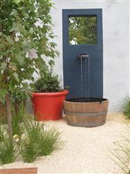
Moving water can be used to reflect the colours around it.
|
|
Contrasting coloured foliage is used here to accentuate the house and statue.
|
Bold coloured pots and containers look amazing in the garden.
|
 VISIT OUR ACS ONLINE E BOOKSTORE
- Quality ebooks written by our staff
- Wide range of Horticulture titles by John Mason, author of over 40 gardening books, garden magazine editor, nurseryman, landscaper and principal of ACS.
- Ebooks can be purchased online and downloaded straight away.
- Read on an ipad, computer, iphone, reader or similar device.
- New titles published every month –bookmark and revisit this site regularly
- Download sample pages for free, to see what each book is like.
More from ACS
Ebook - Inspiring: covers formal, natural, eclectic, modern, oriental, Mediterranean; zoom in on stunning images and plans.
View eBook
Ebook - Explores garden design ideas and inspires
garden design and landscaping!
View eBook
Enhance your design skills and apply them to various garden styles.
View Course
Ebook - a great informative text to extend your knowledge and get it right the first time!
View eBook
Course - draw designs, survey sites, understand plants, soils, timbers, climate, and other landscape materials pivotal to the success of a good landscape design.
View Course